For exploratory data analysis in R, let users focus on what to plot, not how.
To install the latest development branch:
install.packages('devtools')
library(devtools)
devtools::install_github("stefan-schroedl/plotluck")Imagine you have given a new R data frame, and would like to get an overview of the distributions, or see how each column interacts with a specific target column. Typically, you would have to go through each column, and create a 1D or 2D plot depending on its type (e.g., a scatter plot for 2 numerical variables, or a box plot for one factor and one numeric variable). After looking at it, you might realize that outliers make it hard to see most of the data, so you plot it again with a logarithmic axis transform. Or, in the case of a box plot, if you have many factor levels, you might want to sort them first by the y-value.
Plotluck is a tool for exploratory data visualization in
R that automates such steps. It creates complete graphics based on
ggplot; the only things that have to be specified are the
data frame, a formula, and optionally a weight column.
library(plotluck)
data(diamonds, package='ggplot2')
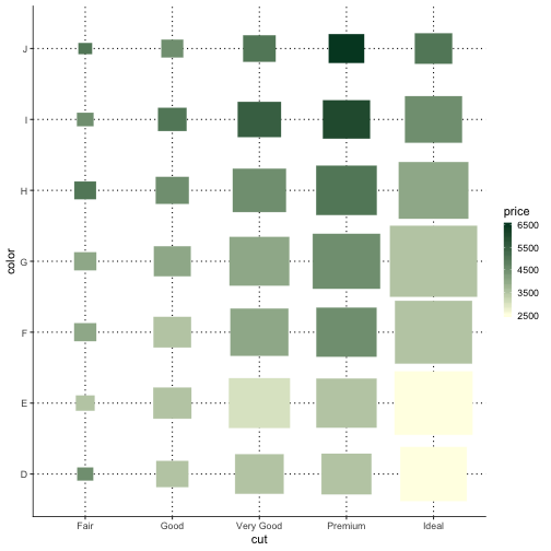
plotluck(diamonds, price~cut+color)
plotluck is
not built forPlotluck is designed for generic out-of-the-box
plotting, and not suitable to produce more specialized types of plots
that arise in specific application domains (e.g., association,
stem-and-leaf, star plots, geo maps, etc). It is restricted to at most
three variables. Parallel plots with variables on different scales (such
as time series of multiple related signals) are not supported.
You can find more examples under
tests/testthat/test_plotluck.R.
More background is given in the vignette.